Color psychology is mostly nonsense 🌈
Marketing gurus want you to believe each color has a fixed meaning.
- 🟦 “Blue = trust!”
- 🟩 “Green = growth!”
- 🟪 “Purple = luxury!”
That’s NOT how color works ❌
The science is clear: Color preferences come from personal experiences.
If blue is your favourite color, it’s because you’ve had positive experiences with blue objects — like a childhood toy or a favourite blanket.
Here’s what actually matters ✅
While we can't control individual color preferences — science discovered 3 properties that affect EVERYONE the same way:
1. Temperature (Warm vs. Cool) 🌡️
Temperature is the only truly universal color meaning.

- 🟥 Warm colors (red, orange, yellow) feel physically closer to us. They create urgency and grab attention.
- 🟦 Cool colors (blue, green, purple) feel physically farther away. They create calmness and less pressure.
That’s why red “Buy Now” buttons outperform blue ones consistently. It’s not about meaning — it’s about proximity.
For CTAs and urgent items, use warm colors.
2. Saturation (Vividness) 🔆
The specific color doesn’t matter here: The more we move to the right (= increase saturation) → the easier it is to notice the color.
That’s why higher saturation makes objects always appear larger.
- 🔶 More saturated = looks bigger
- 🔸 Less saturated = looks smaller

I really love the study that proved it: When people went shopping for suitcases online, they naturally picked vivid colors when they wanted large luggage, and pale colors when they wanted compact ones.
Same suitcase, different saturation - yet it changed how big people thought it was.
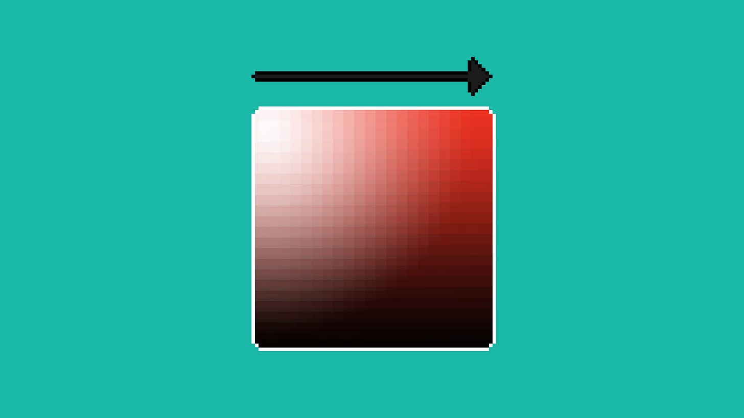
3. Value (Lightness) ⚪️

Universally, it’s common to believe that white = clean. Anything we put on top of the white canvas will be visible and noticeable.
- ⬜️ Light backgrounds create transparency and trust.
- ⬛️ Dark backgrounds create privacy and intimacy.
That’s why adult-only websites are dark (but your online bank account is light).
The Bottom Line 🧠
Forget picking the “right” color. Just answer these:
- Does this element need to feel urgent or immediate? → Use warm colors ✅
- Should this element stand out from everything else? → Increase saturation ✅
- Are we building trust here? → Use a light background ✅
- Do users need privacy? → Use a dark background ✅
That’s it. Pick any color you want - just get these three properties right.
Quick science note: Yes, there’s research showing specific colors = specific feelings. But that gets messy fast (culture, context, trends...). These 3 properties work everywhere, every time. Simple beats complex. Focus on them.